So eons ago I promised a second round of my SASS introduction, and as I recall ever so faintly I wanted to touch on multi-select...although I really misspoke when I called it that, let's just call it advanced selection.
All of this goes into inheritance, which is a common construct in object oriented languages, but was not really a thing in CSS. If you wanted to have specific elements of an unordered list share a style, but have some minor differences based on the context of the list, you really had to either use IDs or replicate a lot of code.
Let's take a look at a nested selection in CSS:
#header{
	div.menu-mobile{ display: none; }
    div.menu-wrapper{
        padding: 50px 0px 0;
        border-radius: 15px;
    }
	.logo {
		text-align: center;
		margin: 5px auto;
        float: left;
		a {
			display: block;
			color: #fff;
			i.fa{
				margin-right: 10px;
				vertical-align: middle;
				position: relative;
				top: -3px;
			}
			img {
				display: block;
				max-width: 100%;
                height: auto;
                margin: 0 auto;
			}
        }
        &.text-logo{
            margin-top: 12px;
        }
    }
So there's a lot going on here, but I included it all for a bit of context. So first we have the ID selector #header that is encasing all this CSS logic. No matter what selector we use in here, if it's not in an element with an id="header" it's all ignored.
Let's take a closer look at the .logo class though. In this we're saying that anchor elements in anything with a class logo should have this definition. More specifically image elements within that anchor element should also have a specific style. but what's that &.text-logo call for? Ampersands in SASS are really neat.
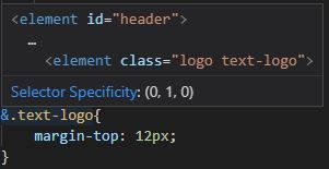
Typically you can designate that multiple classes are required for an element to be styled, but they have to be nested in order. Ampersands let you define that order. An IDE like Visual Studio Code allows us to trace this out visually:

So I can have text throughout an element with a class logo, but if I define an element of text-logo within that logo class element (and only within), add a bit of a margin if you please. So why the ampersand? Well in this case the default behavior of a nested class says to do exactly this. All classes and selectors nested within a defined element will be children of that element...but the ampersand let's us redefine that later without having to necessarily rethink our nesting (that wasn't a fun sentence to write).
Take this as a crazy and useless example:
.logo {
  #header.text-logo & { }
}
This is now telling the compiler to create the following selector:
#header.text-logo .logo {}
Oddly enough this is saying that we should select the .logo class only if the element with an ID of #header also has the .text-logo class.
The second, and far cooler, use for the ampersand is in modifying classes. It wasn't until much later (now really) that I was even aware of the &'s ability to do this, but it's now my favorite.
.class {
  &-first {}
  &-second {}
}
Say I have a class of items defined as above. They share a lot of styling, but the first and second really need some stylistic differentiators on the page. I could easily accomplish this by nesting classes normally. I would then be able to select them by just using both classes. This combines all that and actually creates the classes. The compiled CSS looks like this:
.class-first {}
.class-second {}
The .class-first has all of the styling from .class, and from .-first, and likewise for .-second. See? Really cool right? There is so much more you can do with the & in SASS/SCSS by comining it with psuedo classes, or combinator operations, and more. Next time I'll be comparing mixins and placeholders, and when it is best to use either. Hopefully that'll be up within the next year or so based on my schedule. Till then!

Comments